Google Earth Map for the Timor Sea Maritime Boundary Dispute

Google Earth is an amazing thing, and it’s hard to understand what’s truly going on in the Timor Sea simply by looking at pictures, so I’ve created a Google Earth collection that shows the coordinates provided in the major treaties affecting the region: the 1972 Indonesian-Australian Seabed Boundary Agreement [PDF], the 1981 Provisional Fisheries Surveillance and Enforcement Arrangement [PDF], the 1989 Timor Gap Treaty, the 1997 Water Column Boundary Agreement, the 2002 Timor Sea Treaty, and the 2006 Sunrise IUA/CMATS.

The Google Earth collection for the Maritime Boundaries in the Timor Sea can be downloaded here.

Map Explosion

if you display all of the treaties at once, it kind of looks like a rainbow threw up in the Timor Sea

If you’re interested in figuring out how all these treaties work together, it is probably more useful to just go ahead and play around with it on Google Earth, but I’ve provided a visual summary below using screencaps from the collection.

Continue reading

There’s a Map for That: AT&T sues Verizon

In the first commercial ever to be more annoying than the “Can you hear me now?” ads, Verizon’s latest commercial series, “There’s a map for that,” is a direct attack on AT&T and their “There’s an app for that” iPhone-related marketing campaign.

mapforthat

The ad shows two maps comparing AT&T and Verizon’s 3G network coverage area, with Verizon’s map covering vastly more territory. Now, AT&T had filed suit against Verizon in the Northern District of Georgia, seeking an injunction to prevent further use of the maps in advertising. AT&T alleges that the maps are misleading, as although the Verizon map indicates total coverage, AT&T’s map only indicates a of its network area. This is because Verizon uses only 3G networks. In contrast, the 3G network is only a tiny footprint of AT&T total coverage, which also includes the slower but still usable 2.5G network. AT&T claims, therefore, that the maps are falsely claiming AT&T only has coverage, of any sort, in the tiny blue shaded areas.

Verizon has already changed the ads once before in response to AT&T complaints. Originally, the ad included the words “Out of touch,” which were removed, and Verizon added in small script “Voice & data services available out of 3G coverage areas.” With that modification, I fail to see what meager claim AT&T has remaining. Yes, I am sure many consumers are bad at reading maps and forget to pay sufficient attention to the legends, but that’s, well, advertising. There is nothing at all incorrect or even directly misleading about the advertising campaign — Verizon is just counting on people’s passive ignorance. It’s not nearly as shady as, say, mucking about with the y-axis on two graphs and claiming they show comparable figures.

I’m actually surprised AT&T didn’t just go all out and add in a meritless copyright or trademark infringement claim for the “there’s a map for that” slogan. Instead of going for the obvious meat, however, AT&T appears to have opted for the “Americans are stupid so ads cannot be at all complex” attack.

As discussed before on this blog, maps are inherently nonobjective. To claim that Verizon’s map is “misleading” is the same as claiming its “misleading” to depict a map with Greenland the same size as Africa. AT&T may not like the subject matter which Verizon chose to depict in its maps, but there is nothing incorrect or deceptive about them; they show precisely what they say the map shows, which is a comparison of 3G networks.

-Susan

Interconnected World

I love this map. Via NewScientist, Where’s the Remotest Place on Earth?


[Larger version available here.]

roads_2The map shows the travel times from anywhere on earth to the nearest city with a population of 50,000+. Taking into account roads, navigable waterways, and shipping lanes, the map shows how less than 10% of the earth’s (non-Antarctica) surface area is more than two days travel time away from an urban area. Also cool is how they calculated the travel times, as shown by this chart.

The remotest place of all is located on the Tibetan Plateau (34.7°N, 85.7°E). From this location, “it is a three-week trip to the cities of Lhasa or Korla – one day by car and the remaining 20 on foot.”

-Susan

CritCart: Maps For Liberals

I have a weird fascination with maps — I could probably list “staring at maps” as a hobby, but that’d make me sound like a freak, so I won’t. They’re just cool. I think it’s the combination of so many different fields that appeals to me; there’s so much going on. Pretty much any map is going to involve geography — why do the Rockies dwarf the Blue Ridge Mountains? Why are the Hawaiian islands in a chain like that?; history — take a look at these old maps of Georgia. Atlanta doesn’t even make an appearance until 1855, and Decatur is the regional hub!; art — how to make maps that are, in addition to being accurate, understandable and pretty; math — okay, admittedly, the math part is of less interest to me, but I’m sure if I actually understood the math behind cartography, I’d think it was awesome; anthropology — why are human settlements located where they are?; psychology — psychology and cartography have a lot more to do with each other than you might guess; and politics — especially politics. Plus there’s toponomy, which has got to be one of the coolest academic fields ever. If law doesn’t work out for me, I’m totally going to be a toponymist. And finally, historical mapmaking provides for awesome adventure stories.

Okay, I’ll stop rambling now, but the point of all that? Maps are really cool, and everyone else should recognize that too. And also, more importantly, I’ll probably use this blog to talk about maps at least on a semi-regular basis, so it’d be nice if I could maybe convince a couple people to actually be interested in what I’m writing about.

And as a basic-but-cool intro post on maps, I thought I’d write about critical cartography. Critical cartography is, like critical legal theory, a movement that disputes the idea that our cultural infrastructure is inherently neutral and value-free, and argues instead that our institutions are pervasively biased in a manner that entrenches existing social hierarchies and power structures.

Maps are not photographs; they’re very deliberate, precise, thought out human creations. Maps doesn’t show “how the world really is,” but rather the world as the cartographer wanted to show it. The best introduction to critical cartography is Brian Harley’s Deconstructing the Map [PDF].

The ‘rule of ethnocentricity’ — whereby most societies have maps that place their own homeland in the middle:

“[T]he scientific Renaissance in Europe gave modern cartography coordinate systems, Euclid, scale maps, and accurate measurement, but it also helped to confirm a new myth of Europe’s ideological centrality through projections such as those of Mercator. Or again, in our own century, a tradition of the exclusivity of America was enhanced before World War II by placing it in its own hemisphere (‘our hemisphere’) on the world map. Throughout the history of cartography ideological ‘Holy Lands’ are frequently centered on maps. Such centricity, a kind of ‘subliminal geometry,’ adds geopolitical force and meaning to representation. It is also arguable that such world maps have in turn helped to codify, to legitimate, and to promote the world views which are prevalent in different periods and places.”

And the ‘rule of the social order,’ which results in maps that record not just what the land looks like, but what the social structures between the people on the land look like:

“Pick a printed or manuscript map from the drawer almost at random and what stands out is the unfailing way its text is as much a commentary on the social structure of a particular nation or place as it is on it topography. The map-maker is often as busy recording the contours of feudalism, the shape of a religious hierarchy, or the steps in the tiers of social class, as the topography of the physical and human landscape… it is taken for granted in a society that the place of the king is more important than the place of a lesser baron, that a castle is more important than a peasant’s house, that the town of an archbishop is more important than that of a minor prelate, or that the estate of a landed gentleman is more worthy of emphasis than that of a plain farmer. Cartography deploys its vocabulary accordingly so that it embodies a systematic social inequality.”

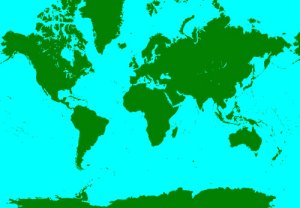
And for a visual example, check out the two maps below — the Mercator Projection and the Gall-Peters Projection. The Gall-Peters map was introduced as a challenge to the more traditional Mercator map — which depicts Greenland the same size as Africa, even though it’s 14 times smaller in reality. Neither map is objectively “more correct” than the other, but it does suggest that the rules of social order and ethnocentricity are alive and well today.
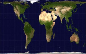
Gall-Peters-Projection

Mercator-World-Map

-Susan

Now I really want to find a global McMap.

Via Strange Maps, there’s a visualization from here showing the lower-48, as depicted by McDonalds locations.

The most McIsolated location in the contiguous U.S. is just north of Glad Valley, South Dakota, and is 145 miles by car to the nearest McNuggets six piece.

I love how you can see U.S. settlement patterns just from a map of McDonalds locations. The major cities are obvious hubs, but even cooler are the gaps — you can distinctly see the Okefenokee as a small gap in Southern Georgia, and then at the bottom edge of Florida, just above the Key West McDonalds, you can see where the Everglades are.

As for the gap midway up the east coast, I guess that’s maybe Albermarle sound, in North Carolina? You can very clearly follow down the coast from New York-Pennsylvania-Baltimore/D.C.-Richmond-Virginia Beach, so south of that, at the point that juts out most eastward, would be about right. Plus the little pinchers that stick out around the gap would be the barrier islands around it. I find it curious you could see Albermarle Sound clearly, though, while Chesapeake Bay, which is much bigger, is barely a thin wriggle.

You can also see a big gap in the West Virginia mountains (the Monongohela?), the only McGap of its size anywhere on the east. You’ve also got a gap at the Adirondacks farther up north, and below that, there’s a jutting squiggle… It’s about the right place for the Allegheny National Forest, but the shape of it doesn’t seem quite right, so not entirely sure what explains the lack of Maccas there.

Unfortunately, I’m not familiar enough with the west portion of the U.S. to really pick out any features, but it is cool how you can very clearly see the skeleton of the interstate system dotted out. You can see a few on the east, too — check out 1-20 stretching out east from Dallas towards Atlanta, and I-81 between Knoxville and Richmond — but they’re not as clear.

And around North Dakota, it totally starts to look like a bunch of cells in the midst of mitosis. Maybe that’s how McDonalds chains reproduce.

-Susan